The Most Average Business Card
A heatmap created from over a thousand business card templates.
Why though?
I was recently asked if I had a business card.
Usually, I share my contact details and website using a QR code and digital wallet pass on my phone. In this instance my usual approach failed me, and I decided it was time to get a “proper” business card printed. While scrolling through (thousands of) templates trying to find one that I liked, I had an idea… what if I made my business card a data visualisation?
Ink is most likely in two places down the left of the card, one high and one low, and least likely along the top edge.
% of business cards with ink at any given location
The final card, shown above (tap it for more detail), is a probability distribution heatmap of where there is and isn’t ink across a dataset of 1,055 business card templates, the ones pictured below.
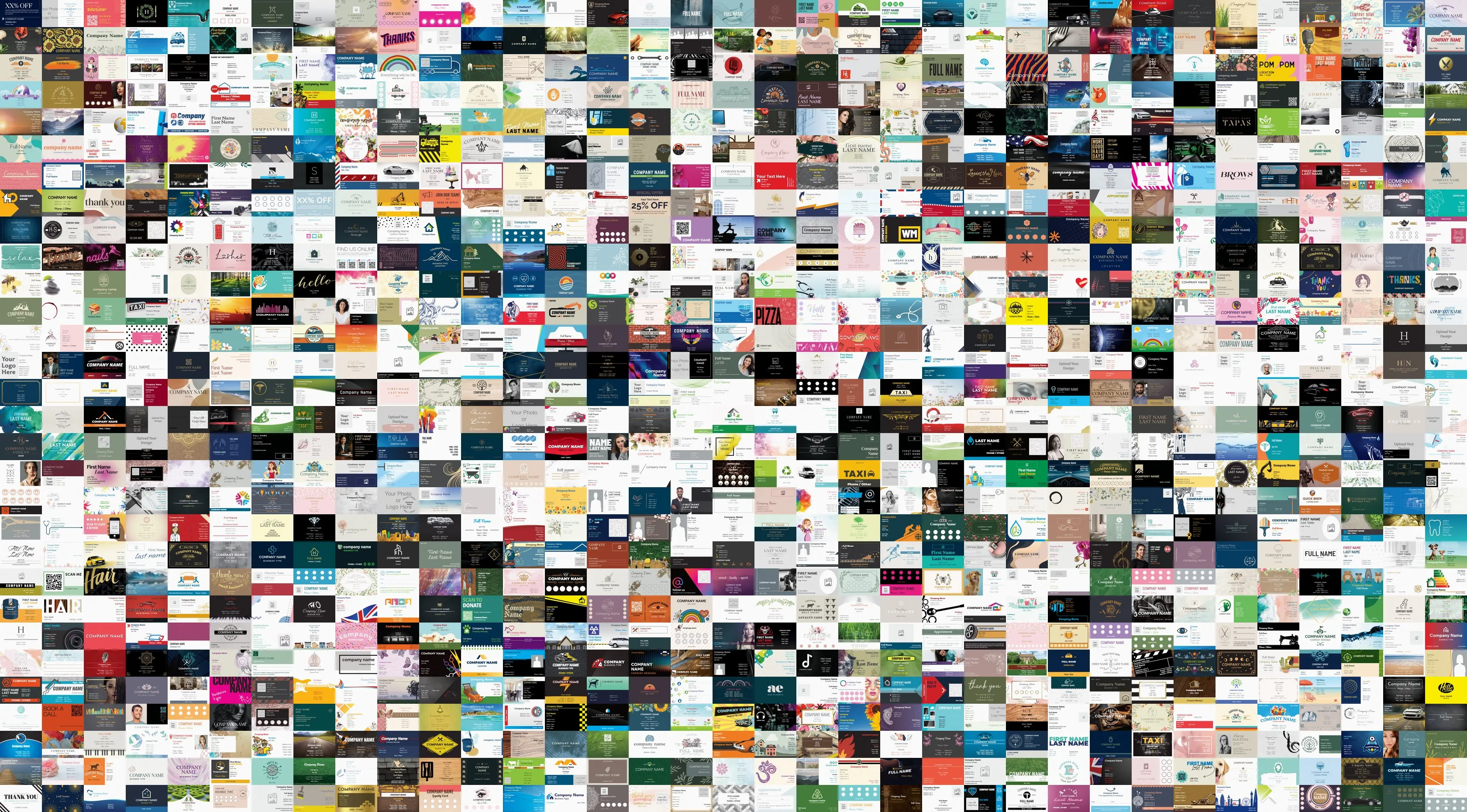
The 1,055 business card templates used to generate the heatmap. The keen-eyed among you might notice there are only 1,050 shown here, that’s because 1,055 can’t be arranged into a rectangle.
Deciding what to measure
To create the most average business card, I first had to decide what feature to average. I chose to explore three: ink, edges, and text. Below is an example of how I measured each for some different cards from the dataset. Tap on each one for a brief description of how the feature was derived, and use the arrows to see the different cards.
Full card
One example business card.
Every card template had its background removed and was resampled to a common pixel grid, to ensure consistency across the dataset.
Ink
Measures ink coverage.
Anywhere the card is darker than near-white is classified as ink, by converting the pixel grid to greyscale and thresholding.
Edges
Measures visual structure.
Borders, rules and outlines are detected using the Sobel gradient magnitude (how sharply brightness changes at each pixel), normalised against the card’s own strongest edge.
Text
Measures where words are.
Detected with EasyOCR’s CRAFT detector, keeping only boxes above 0.3 confidence.
For all 1,055 business card templates, I calculated ink, edge, and text coverage before averaging over each to generate three different heatmaps. I chose ink for the final card you’ve seen, but the edges and text versions are both included in the explorer further down this page.
Design decisions
When creating a heatmap there are two key design decisions: colour and binning.
For simplicity colour can be split into hue and intensity, where hue is the shade (red, green, blue, etc.) and intensity is how light or dark the shade is. Since colour hue does not carry inherent order (red is not perceived as more or less than green or blue), colour intensity should generally be used to represent the data in a heatmap. The example below demonstrates this: toggle the switch to greyscale to see the colour hue based heatmap fall apart.
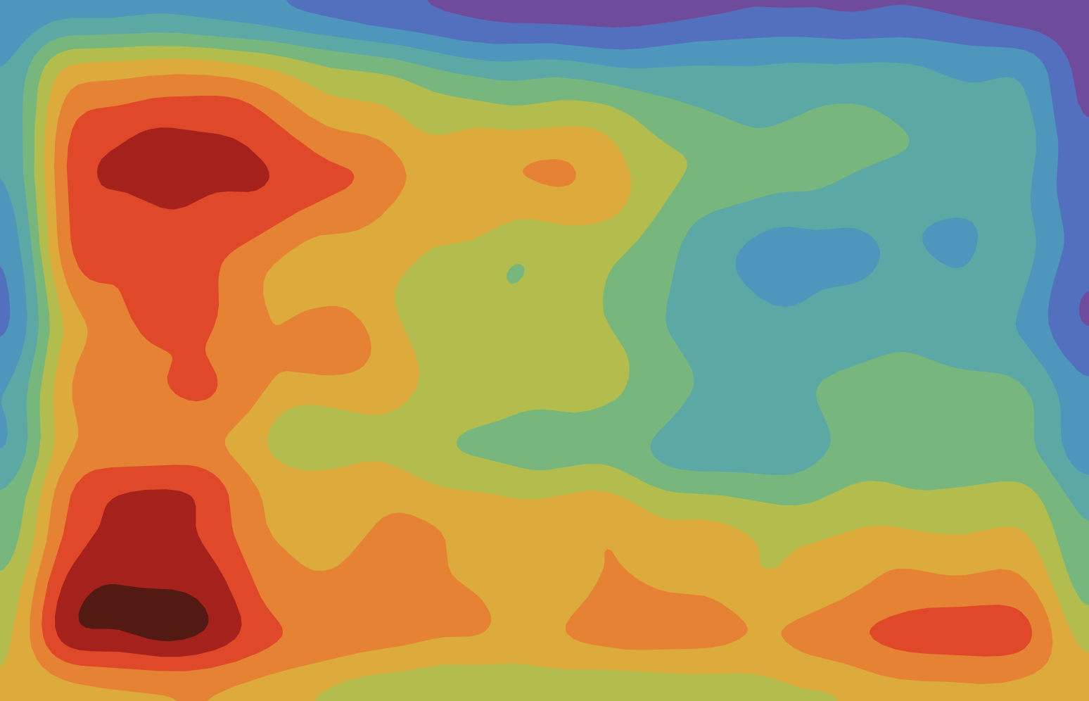
Colour hue
Hue used to represent value, intensity varies

Colour intensity
Linear intensity ramp
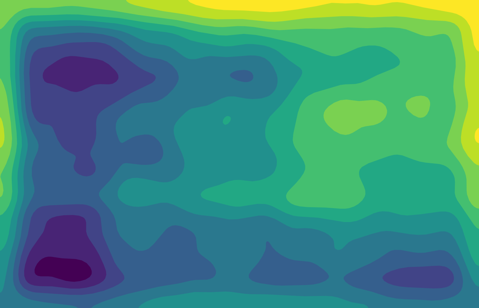
Colour intensity + hue
Linear intensity ramp with changing colour hue
This doesn’t mean we can only use colour intensity. Colour hue can also be used, provided it is built on top of a linear colour intensity ramp. The Viridis palette used in the final card is one example of this, and four other examples are shown in the explorer below.
Binning refers to the post-processing of the heatmap data. The analysis produces a grid of pixels, each with a value calculated from the average of the 1,055 business card templates. That grid can be drawn two ways.
Continuous maps each pixel straight onto the colour ramp. It’s the most honest representation of what was measured, but noise is rendered as confidently as real structure, and reading a value back off a smooth legend means interpolating by eye.
Binning groups the values into classes first. We lose resolution and introduce an editorial decision which influences the final heatmap: how to bin the data. However, the binned edges can be easier to interpret, and the legend becomes a lookup rather than a guess.
I chose binned for the final card, since it is printed in CMYK and held at arm’s length, where flat blocks reproduce more cleanly than a gradient, and the binned edges reflect the block structure of the card templates the heatmap is produced from. The continuous version for each heatmap is shown in the explorer below.
To learn more about heatmap colour and binning in data visualisation, check out the references at the bottom of this page.
Explorer
Explore the different heatmap variants I created in this project. Vary the feature, colour palette, and binning approach.
Loading the explorer…
One limitation worth stating. Every card in the dataset is a template, complete with filler text and placeholder images. Real business cards would almost certainly show more variation than this. I used templates because they were far easier to collate into a dataset of this size.
References
Colour
- Crameri, F., Shephard, G. E. and Heron, P. J. (2020) The misuse of colour in science communication. Nature Communications, 11, 5444. https://doi.org/10.1038/s41467-020-19160-7
- Borland, D. and Taylor II, R. M. (2007) Rainbow color map (still) considered harmful. IEEE Computer Graphics and Applications, 27(2), pp. 14–17. https://doi.org/10.1109/MCG.2007.323435
Colour palettes
- van der Walt, S. and Smith, N. J. matplotlib colormaps. https://bids.github.io/colormap/
- Tol, P. Paul Tol’s Notes: colour schemes and templates. SRON/EPS/TN/09-002. https://sronpersonalpages.nl/~pault/
- Brewer, C. A. and Harrower, M. ColorBrewer: color advice for maps. https://colorbrewer2.org/
Binning
- Padilla, L., Quinan, P. S., Meyer, M. and Creem-Regehr, S. H. (2017) Evaluating the impact of binning 2D scalar fields. IEEE Transactions on Visualization and Computer Graphics, 23(1), pp. 431–440. https://doi.org/10.1109/TVCG.2016.2599106
- Reda, K., Nalawade, P. and Ansah-Koi, K. (2018) Graphical perception of continuous quantitative maps: the effects of spatial frequency and colormap design. Proceedings of the 2018 CHI Conference on Human Factors in Computing Systems, pp. 1–12. https://doi.org/10.1145/3173574.3173846